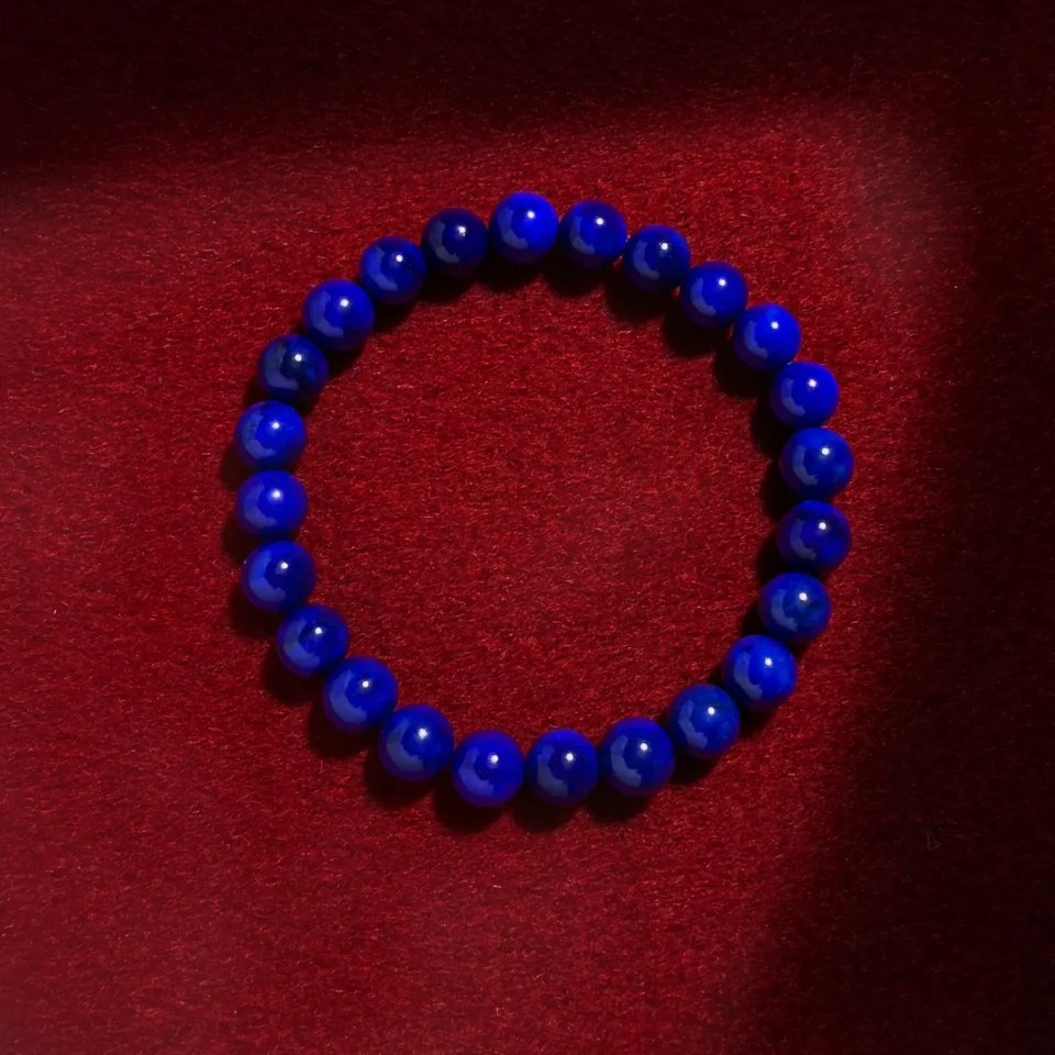
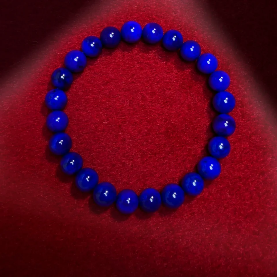
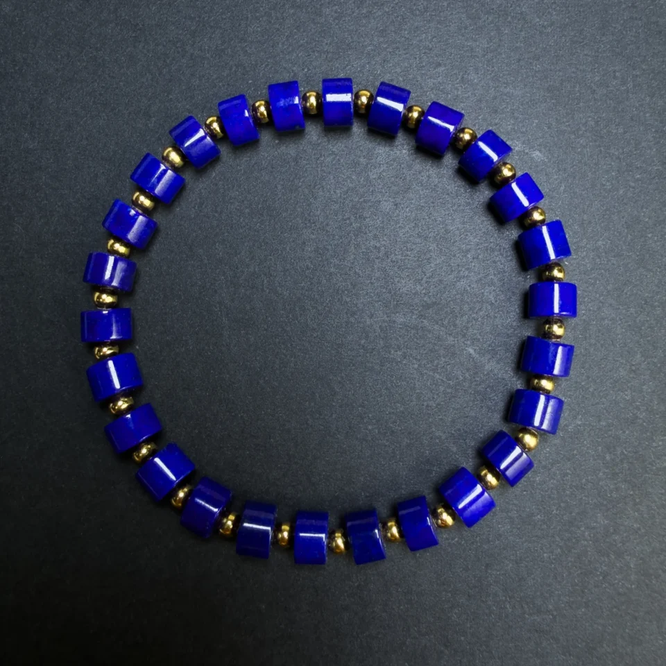
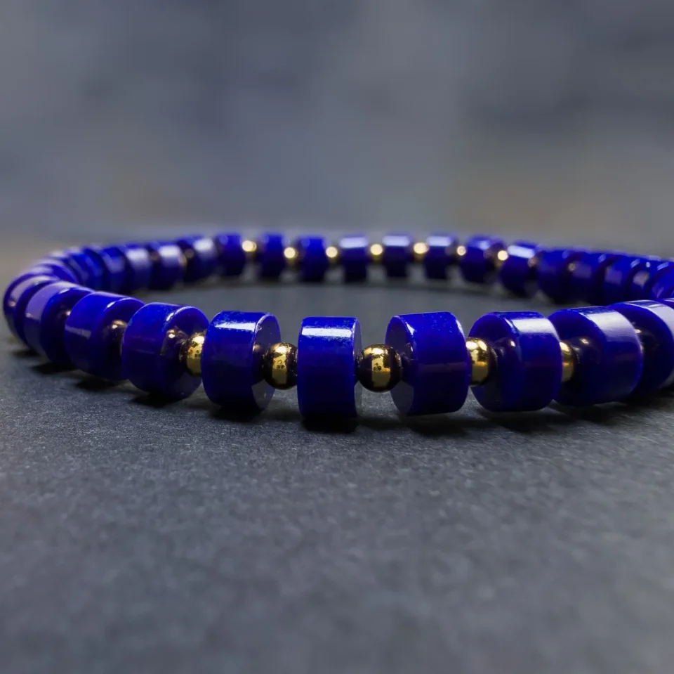
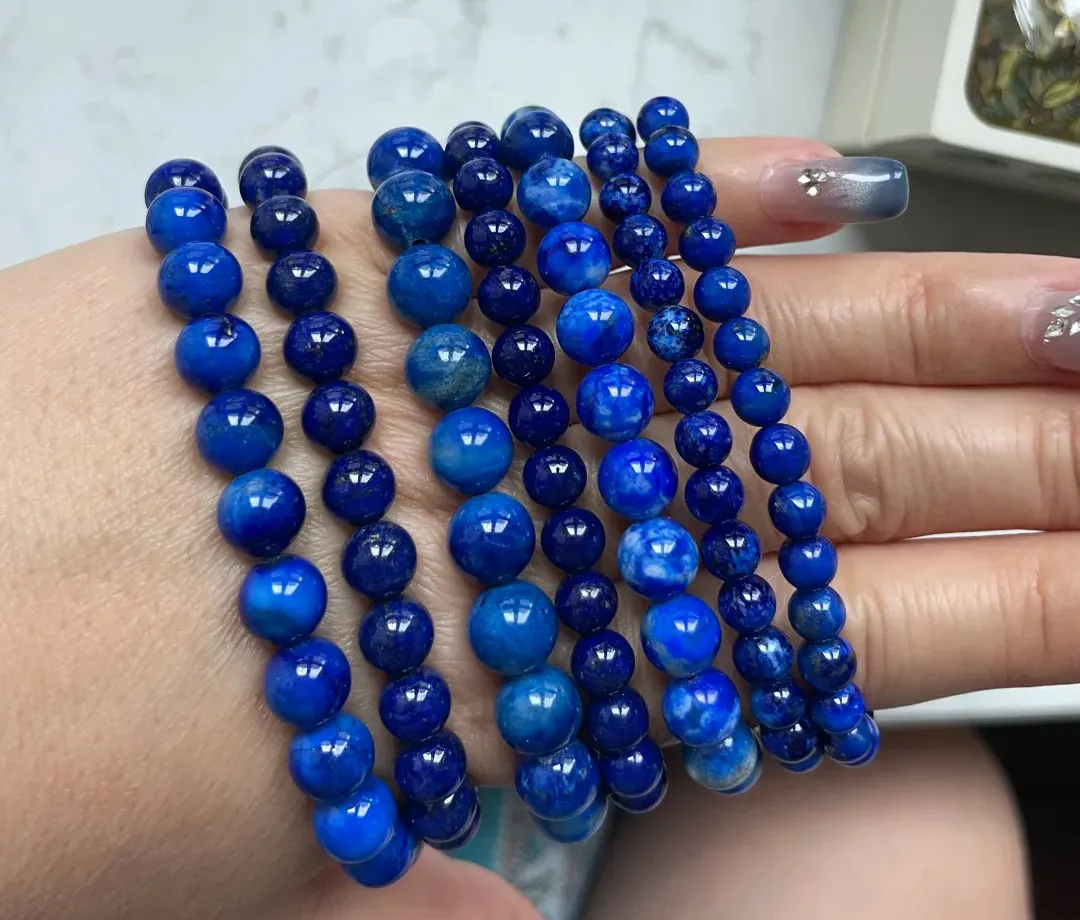
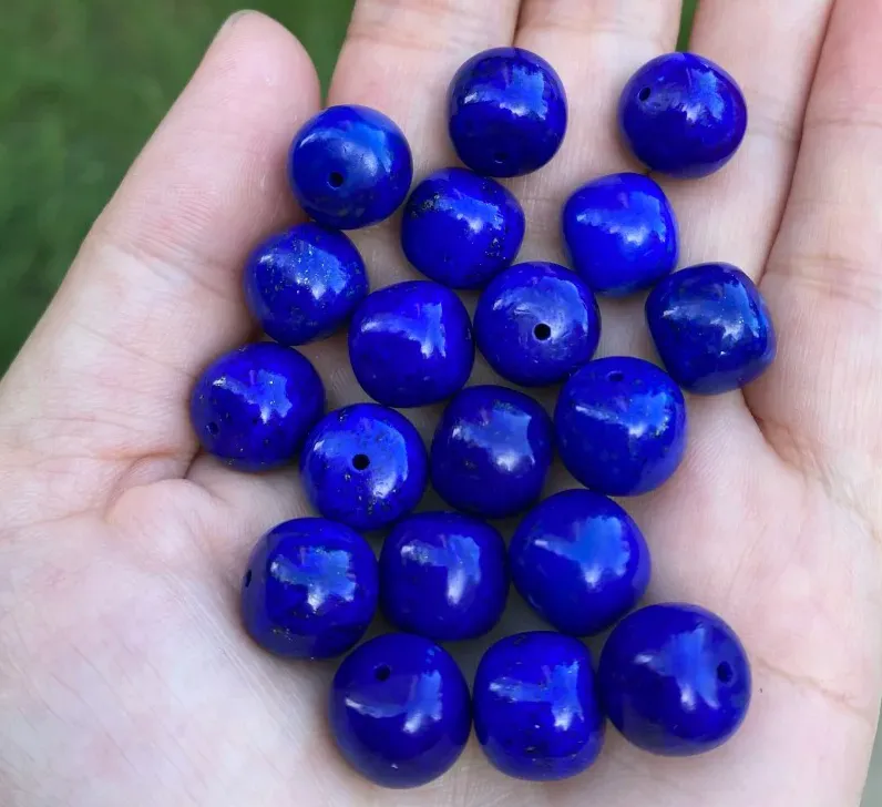
Lapis lazuli is blue, but not one fixed blue. Natural stones can range from softer grayish or slightly greenish blue to saturated royal blue, deep indigo and slightly violetish blue. White calcite may break up the blue, while gold-colored pyrite can appear as small metallic flecks. In the market, the most valued material is usually the blue that looks rich, even and highly saturated—not simply the darkest stone on the table.
What Color Is Natural Lapis Lazuli?
The short answer is: blue, usually in the medium-to-dark range. GIA’s description of lapis lazuli describes the characteristic hue as running from slightly greenish blue to violetish blue, with terms such as royal blue, indigo, midnight blue and marine blue commonly used in the trade.
Those names are useful descriptions, not a universal laboratory color scale. Two sellers can both call a stone “royal blue” while showing noticeably different saturation, tone and mineral pattern. For a buyer, the photograph matters more than the adjective.
A clean, vivid royal blue is the look most people immediately associate with fine lapis. But genuine lapis can be lighter, grayer, more mottled, or marked with white and gold-colored minerals and still be natural lapis lazuli.
Why Is Lapis Not Always the Same Blue?
Lapis lazuli is a rock made from several minerals rather than a single mineral crystal. Lazurite is the main source of the prized blue color; calcite commonly appears as white areas, and pyrite creates the familiar metallic gold-colored flecks. Their proportions and distribution vary from one piece of rough to another.
That is why two stones can both be lapis lazuli and still look very different. One may show a broad, uninterrupted field of strong blue. Another may have white streaks running through it. A third may carry fine pyrite across the surface. Once the material is cut into beads or cabochons, these differences become easier to compare side by side.
Which Lapis Blue Is Most Valuable?
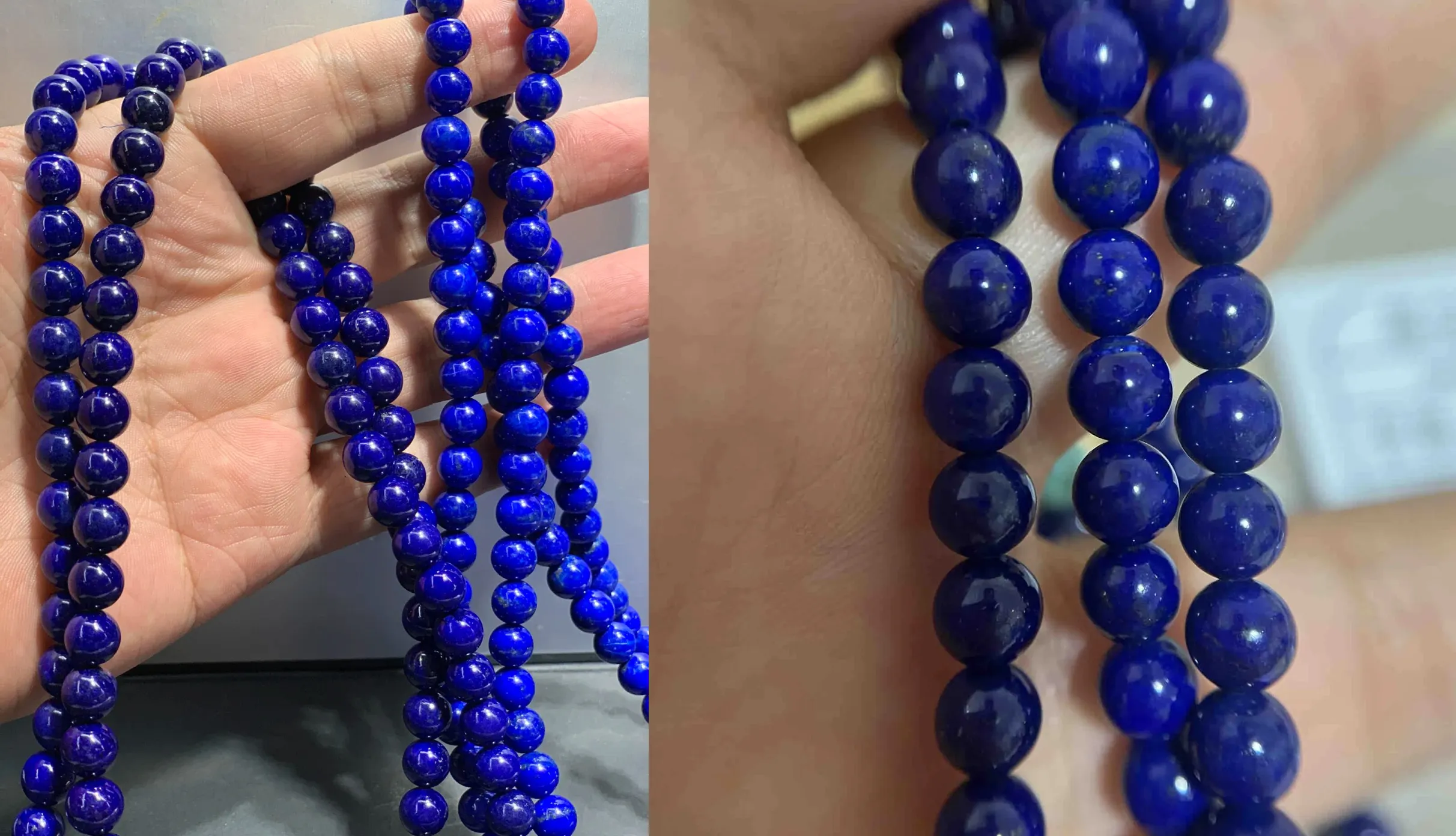
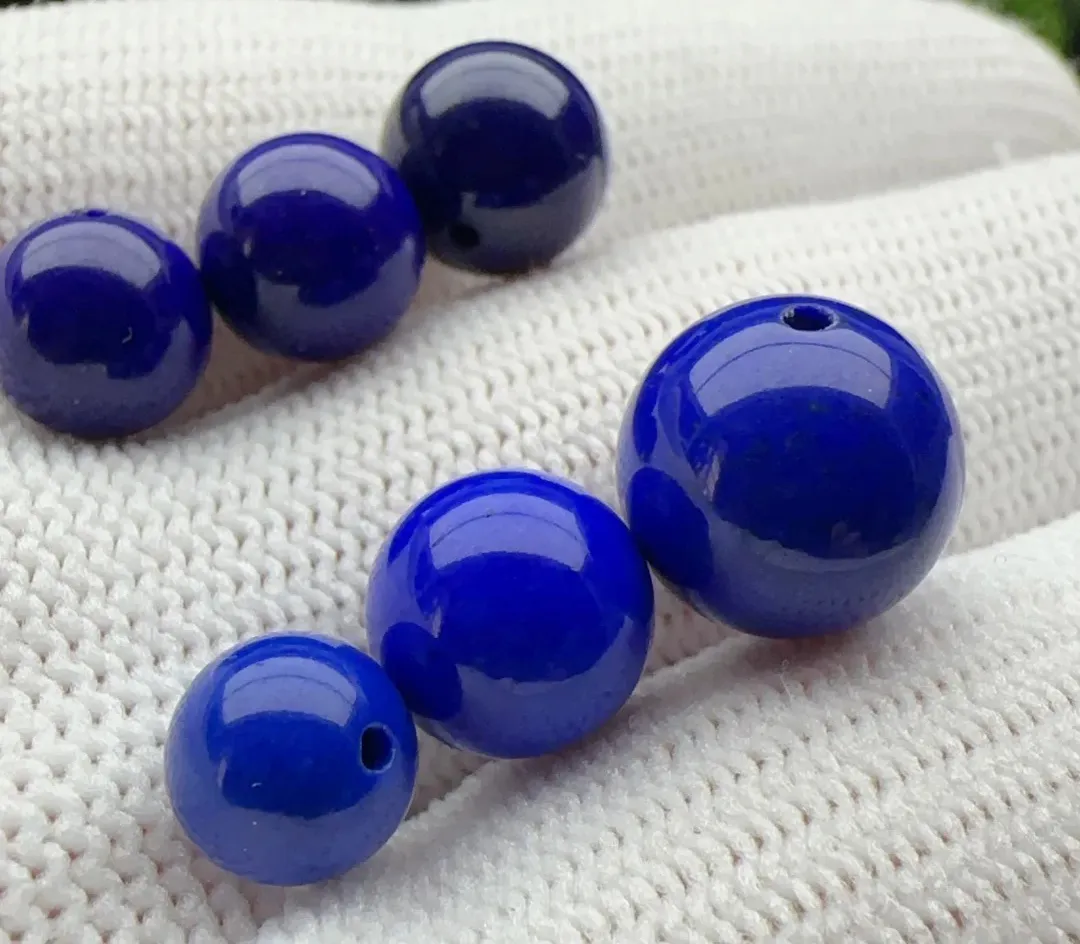
For traditional market value, color is the first place to look. GIA’s lapis lazuli quality factors identify the most valued material as intense, uniform, medium-dark to dark blue or slightly violetish blue, with no visible calcite; small, attractively distributed pyrite can still be acceptable.
A practical ranking can help a beginner understand the market, as long as it is not mistaken for an official grading system. The hierarchy below assumes that other factors—treatment, size, workmanship and condition—are broadly comparable.
| Practical color tier | Typical appearance | Typical market position |
| 1. Saturated royal to slightly violetish blue | Rich, vivid and reasonably even; medium-dark rather than blackish; little or no visible calcite. | Highest, all else equal |
| 2. Deep saturated blue | Strong deep blue that still looks lively; may show restrained fine pyrite or very minor pale matrix. | Very high |
| 3. Medium rich blue | Clearly attractive blue, but less saturated, slightly lighter or somewhat less even. | Good to mid-high |
| 4. Grayish or calcite-mottled blue | Softer, denim-like or cloudy impression; visible white calcite breaks up the blue field. | Moderate |
| 5. Pale, dull or greenish blue | Weak saturation, heavy pale matrix, or an overall muddy/greenish appearance. | Lower |
The key word is saturated. A stone can be extremely dark and still look flat, gray or lifeless. A slightly lighter blue with stronger saturation and better uniformity can look finer—and may be more desirable—than a nearly black-blue stone.
If you want a fuller discussion of saturation, uniformity, treatment and matching in finished pieces, see our detailed blue lapis lazuli quality guide. This page stays focused on color itself.
Why Do Some Lapis Stones Look Gray-Blue?
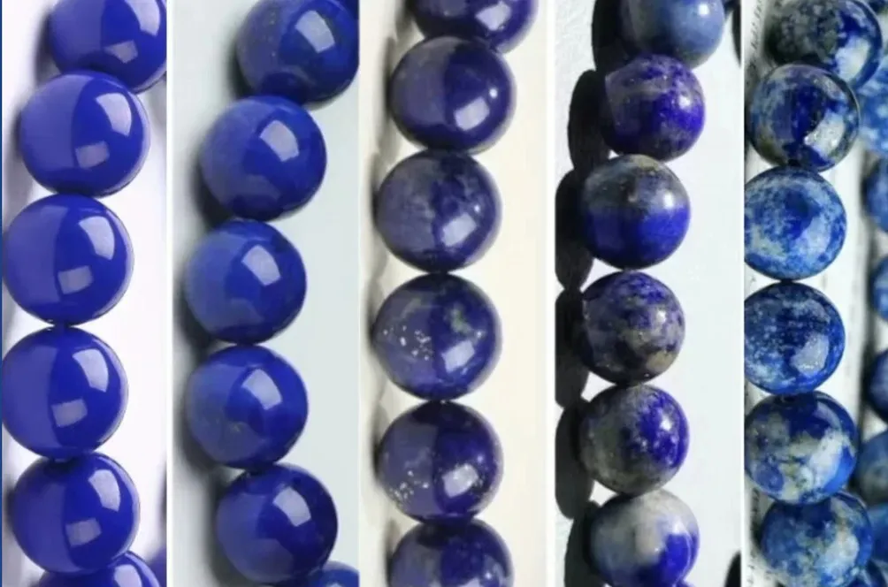
Gray-blue lapis often comes from a combination of lower blue saturation and visible pale mineral content. When many small white calcite areas sit inside the blue, the eye can blend them together at normal viewing distance, giving the stone a softer, dusty or denim-like blue impression.
That appearance is not automatically a sign of fake lapis. Calcite is a natural component of the rock. It does, however, move the stone away from the clean, saturated blue traditionally preferred at the top end of the lapis market.
Surface quality also matters. A coarse-looking or poorly finished surface can make a muted blue appear even flatter. A good polish improves luster and makes the existing color easier to see, but it does not remove calcite or turn a gray-blue piece into a clean royal-blue one.
What Do White Calcite and Gold Pyrite Do to the Appearance?
White Calcite Softens and Breaks Up the Blue
White streaks, spots and patches in lapis are commonly calcite. In a clean blue stone, a small pale area may be easy to ignore. In a bead strand, repeated calcite can make the overall piece look lighter, more mottled or gray-blue. For buyers seeking a saturated, uninterrupted blue, obvious calcite usually lowers commercial value.
Pyrite Can Add Character—But More Is Not Automatically Better
The metallic gold-colored flecks commonly seen in lapis are pyrite, not gold. Fine, scattered pyrite can look attractive against strong blue and does not necessarily reduce value. Heavy concentrations can become the first thing the eye sees, interrupting the blue rather than complementing it.
For color evaluation, blue should still lead. A lapis stone does not become finer simply because it contains more “gold.”
How Do Different Lapis Colors Work in Jewelry?
Market value and design usefulness are not the same thing. A clean royal-blue stone usually ranks higher in the traditional lapis market, but a softer gray-blue stone can be more convincing in a vintage design. The best pairing depends on the character of the material rather than on a rule that every piece must use the highest-value blue.
Royal Blue Lapis + Gold
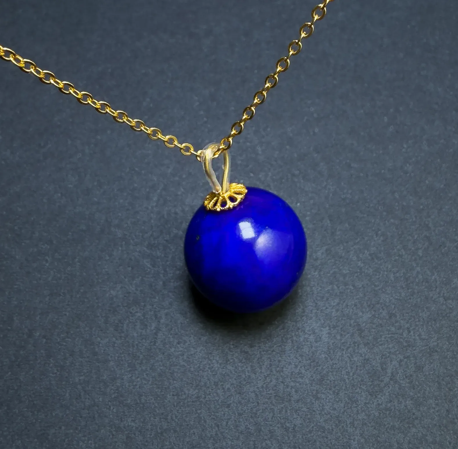
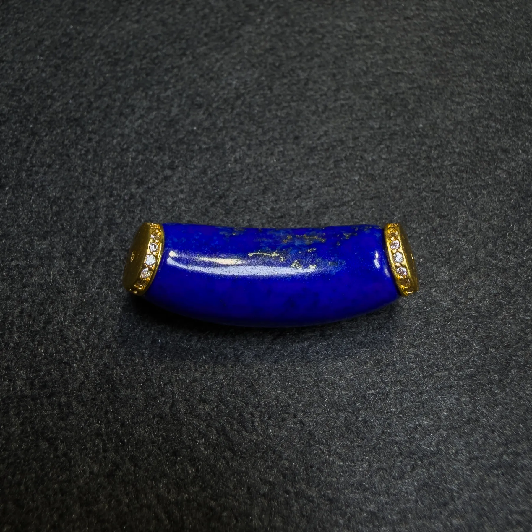
Saturated royal blue works especially well with yellow gold or warm gold-tone metal. The color contrast is strong: the blue reads cooler and deeper, while the metal adds warmth around it. With very clean lapis, a restrained gold setting is often enough; the stone does not need much decoration.
A simple example is the Natural Imperial-Grade Round Lapis Lazuli Pendant , where the warm gold-plated frame sits directly against a saturated royal-blue surface.
Deep Blue Lapis + Pearl or Mother-of-Pearl White
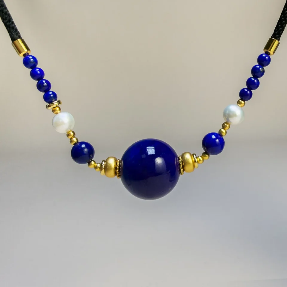
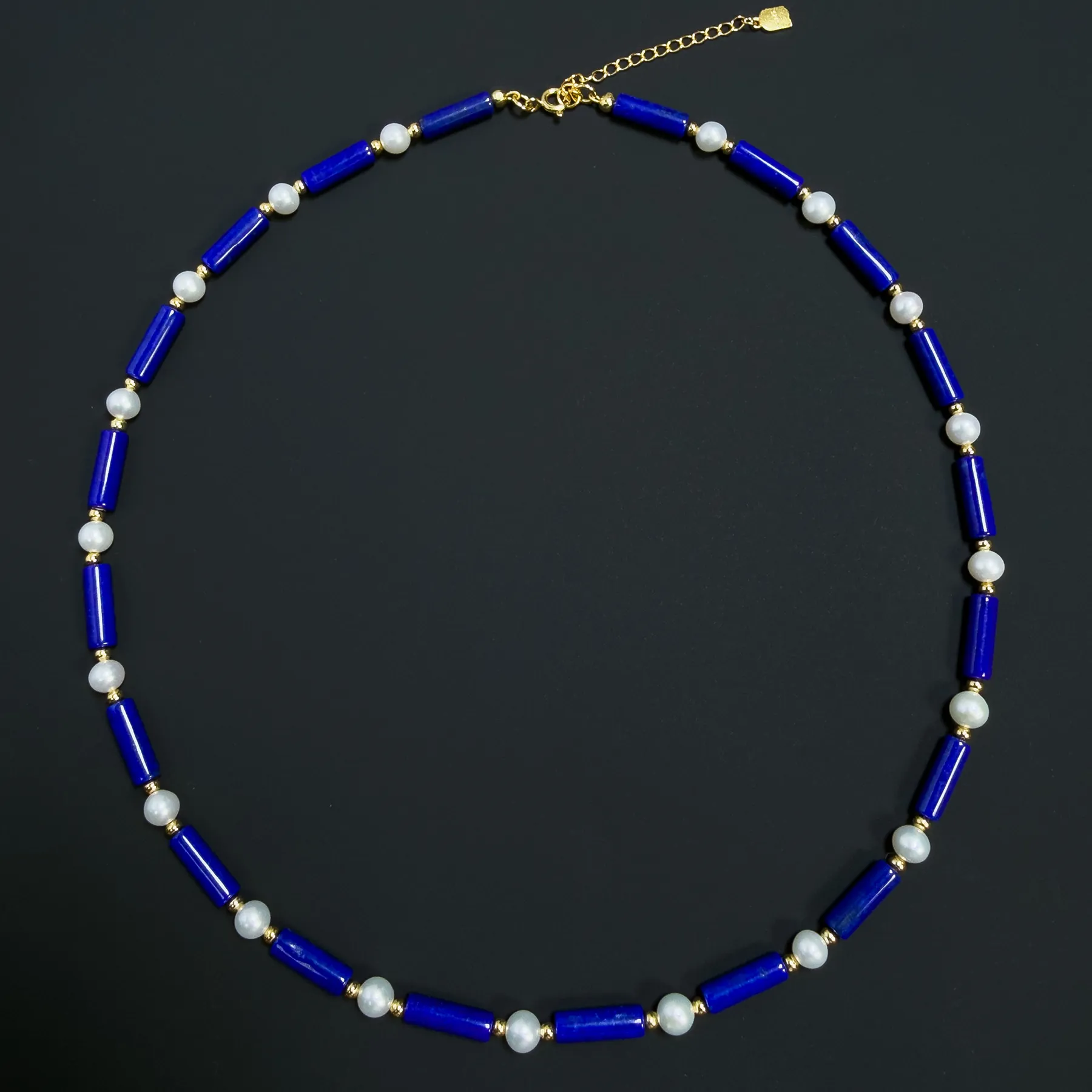
Deep blue lapis also pairs naturally with white, but pearl and mother-of-pearl create different moods. Cultured pearls have a soft, rounded luster, so the contrast feels gentler and more classic. White mother-of-pearl is flatter and more iridescent, which can make the same deep blue feel cleaner and more graphic.
In both cases, the white material gives the eye a bright pause between areas of blue. The effect is especially useful when the lapis itself is deep and saturated.
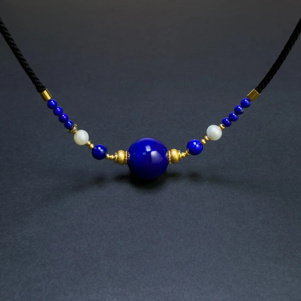
For a real blue-and-white example, see the Natural Lapis Lazuli Tube Bead & Cultured Freshwater Pearl Necklace.
Grayish or Calcite-Rich Blue + Antiqued Silver
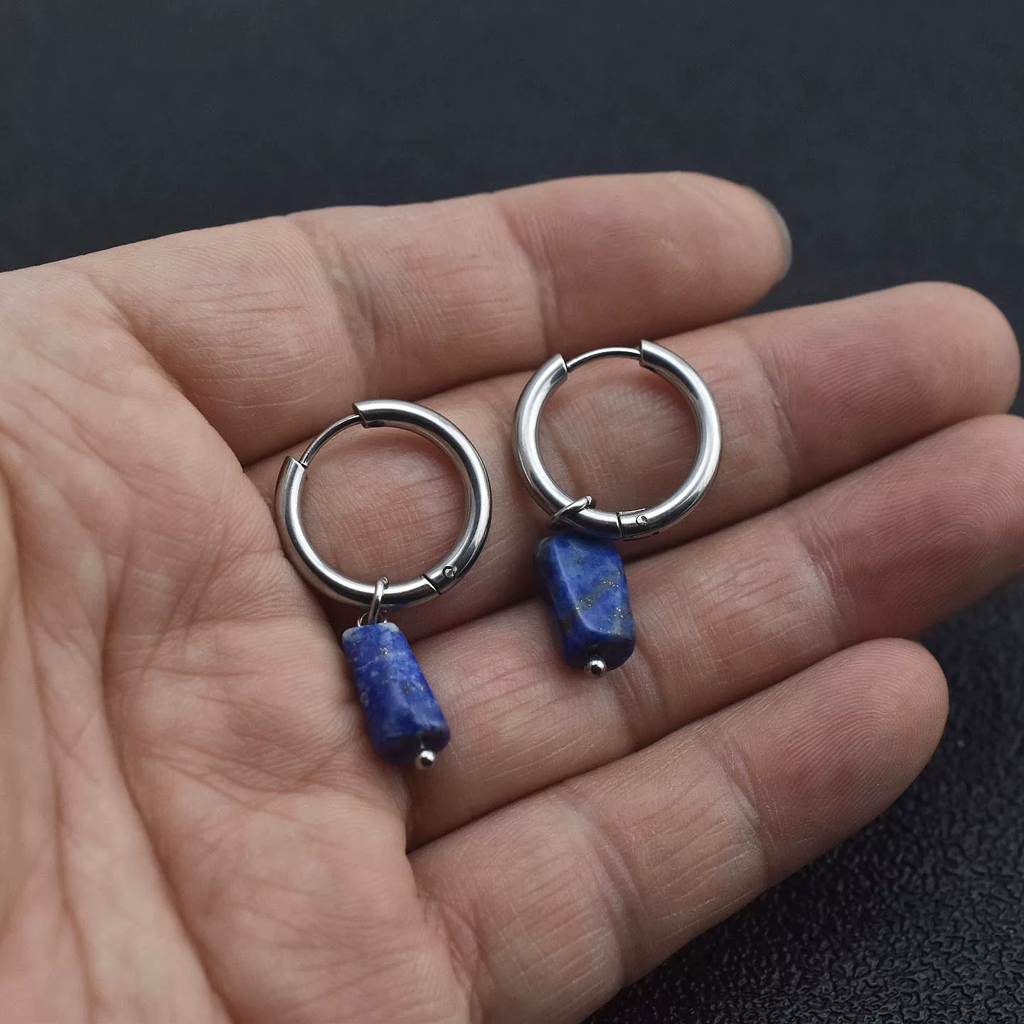
Lapis with more visible calcite can look softer, grayer or more mottled. That material usually sits below clean royal blue in traditional market value, yet its muted character can work very well with oxidized or antiqued silver. The darker metal echoes the stone’s subdued tone instead of trying to make it look brighter than it is.
This is a design judgment, not a gemological rule. The point is that lower market value does not mean the material has no visual use. A gray-blue stone can feel intentional in a vintage, organic or weathered design.
Blue with Visible Pyrite + Gold Accents
When lapis contains fine visible pyrite, gold-tone metal can pick up the same warm metallic note. The pairing can look cohesive because the setting echoes a color already present inside the stone. This works best when the blue still dominates; a pyrite-heavy stone does not become more valuable simply because the metal matches it.
So, What Color Lapis Should You Choose?
If your priority is traditional market value, start with saturation and uniformity: a rich royal to slightly violetish blue with little visible calcite is the classic top-end look. If your priority is design, the answer can be different. Deep blue can be striking beside pearl white; gray-blue can feel deliberate with antiqued silver; fine pyrite can make a gold-accented piece more visually connected.
The useful distinction is simple: market value ranks material by what the lapis trade tends to prize, while jewelry design asks what the stone can do in a finished piece. Those two questions overlap, but they are not identical.
If you want to see how the color and surface become easier to judge during cutting, rounding and polishing, read how Afghan lapis moves from rough stone to finished beads . For finished examples, browse our lapis lazuli jewelry .
The Color of Lapis Is a Range, Not a Swatch
“Lapis blue” is useful shorthand, but natural lapis lazuli is more interesting than one standardized shade. Its blue can be royal, deep, slightly violetish, softer or gray-blue, and the white calcite and gold-colored pyrite inside the rock can change the way that blue reads at a glance.
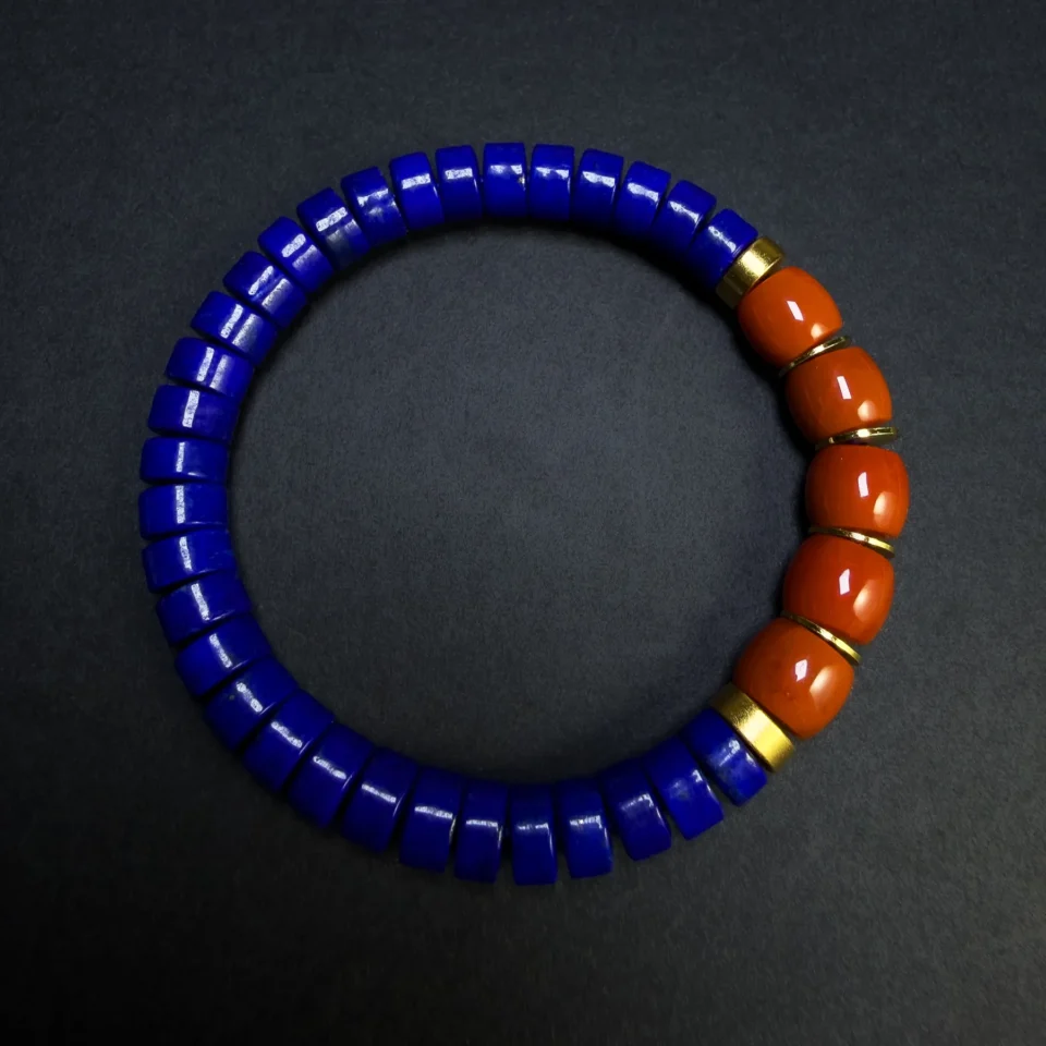
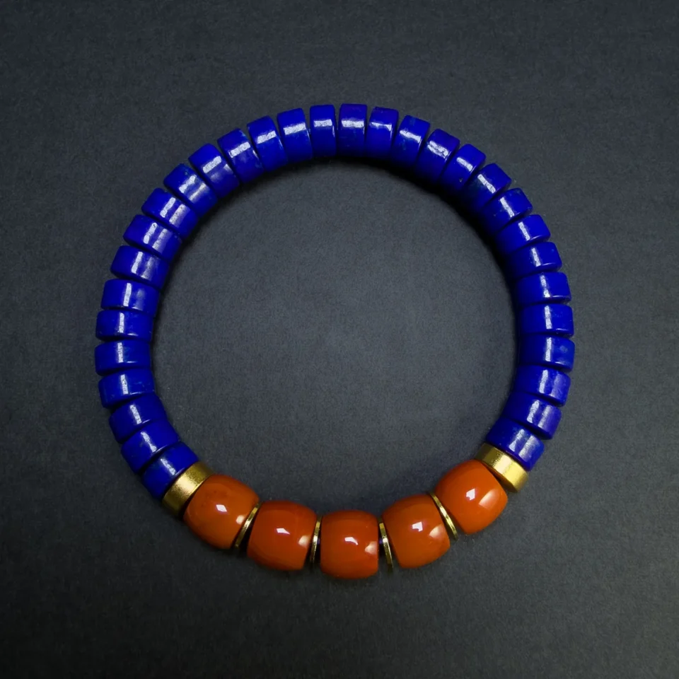
For quality, the market usually rewards saturation, evenness and a clean blue field. For jewelry, different shades can still have different strengths. The best way to understand that difference is not through color names alone, but by looking at real stones photographed under the same conditions.
Does “Lapis Blue” Have a HEX Code?
In digital design, “Lapis Lazuli” is sometimes represented by colors such as #26619C. That is a design convention, not an official color standard for the natural stone. Real lapis lazuli varies from greenish and grayish blue through royal blue and deep violetish blue, so no single HEX value can represent every natural specimen.